The SPY bumbling around
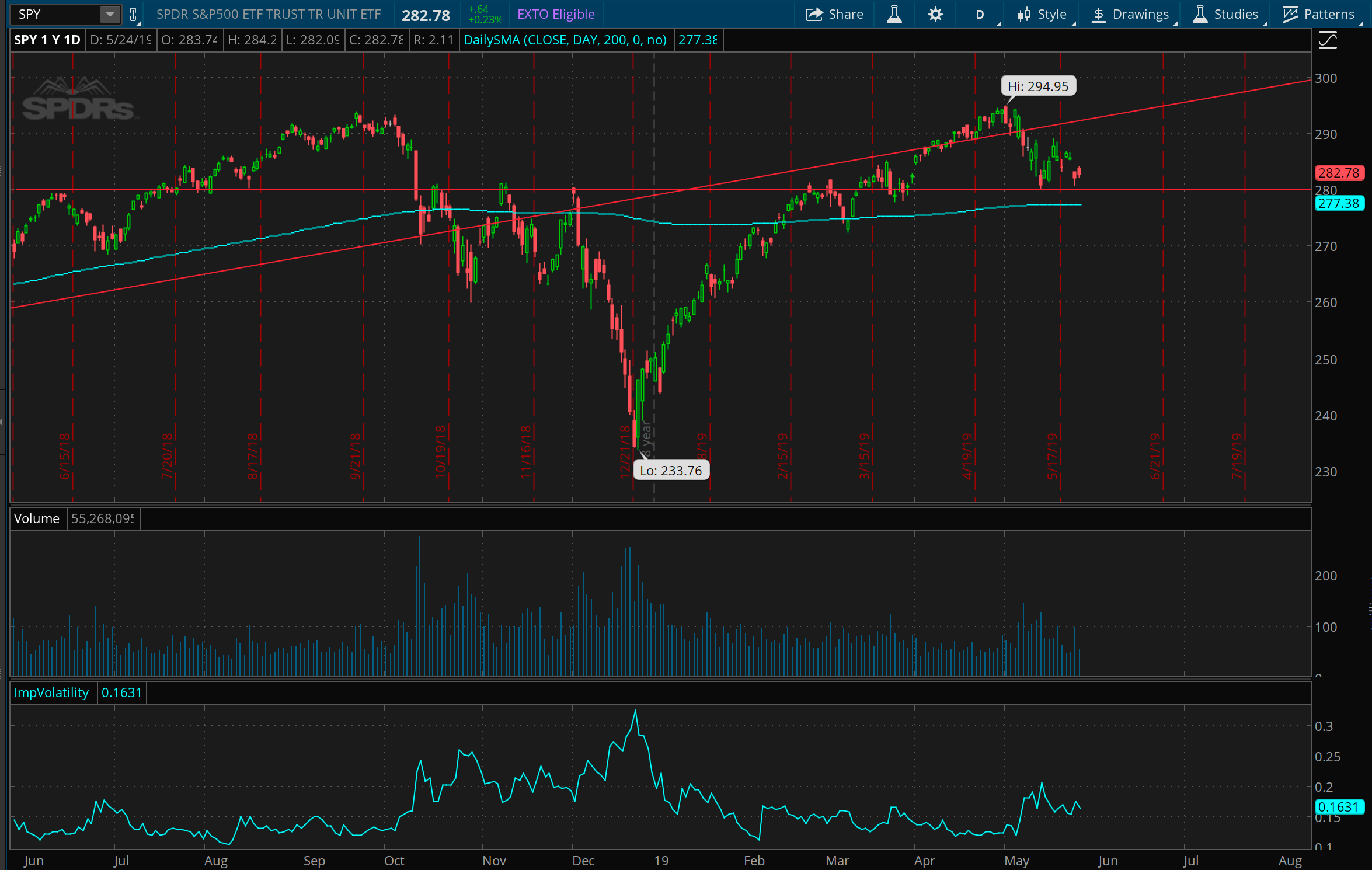
The SP 500 for the past year. We’re bouncing around near an important price range, near 280. We failed to overcome this level at least 4 times last year, in June, October, November, and December, and then struggled against it during February this year. But, it may have now flipped from resistance to support. If we get down to 275 soon, it could certainly mean some downside for a bit.
But the Nasdaq is… also bumbly
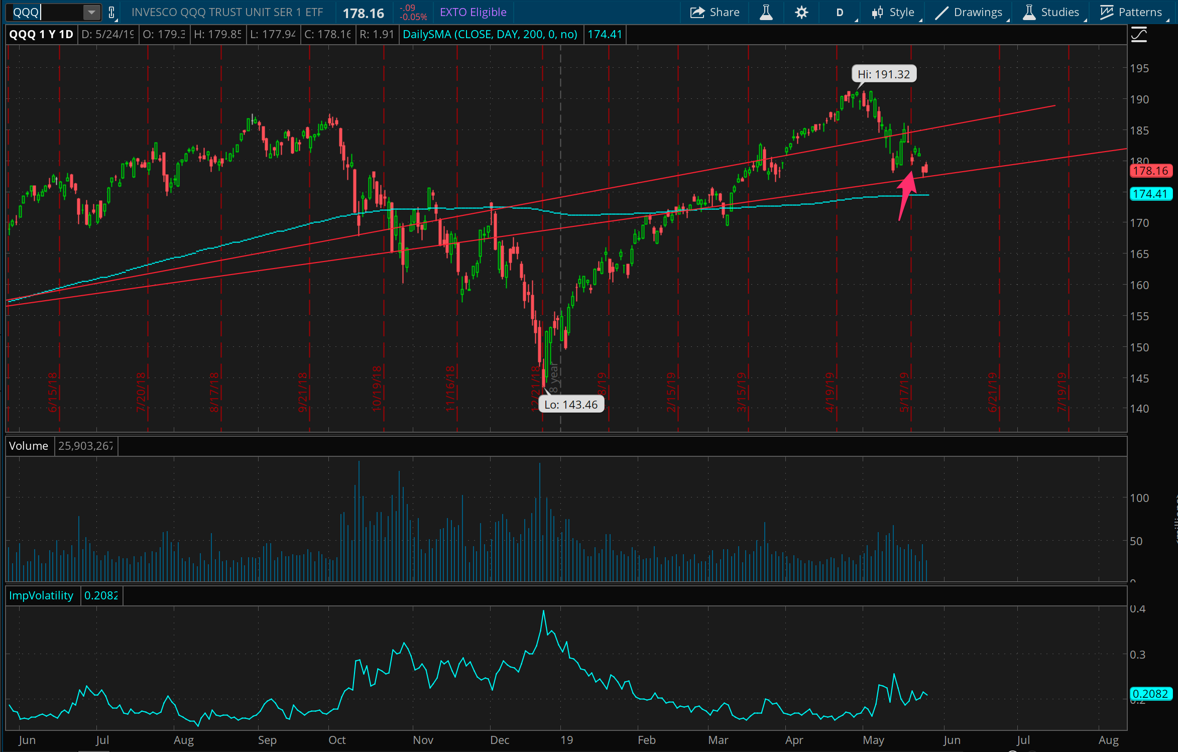
Similar story with the Nasdaq. As we talked about last week, it looks like the Qs could be bouncing around between 175 and 185 for a few weeks. I also said I’d trade on some support around 175 on a quick move to 180, which we got on Monday. Did this as a put spread with defined risk (indicated by the arrow), because if it breaks well below 175, things could get pretty ugly.
AAPL == UGLY
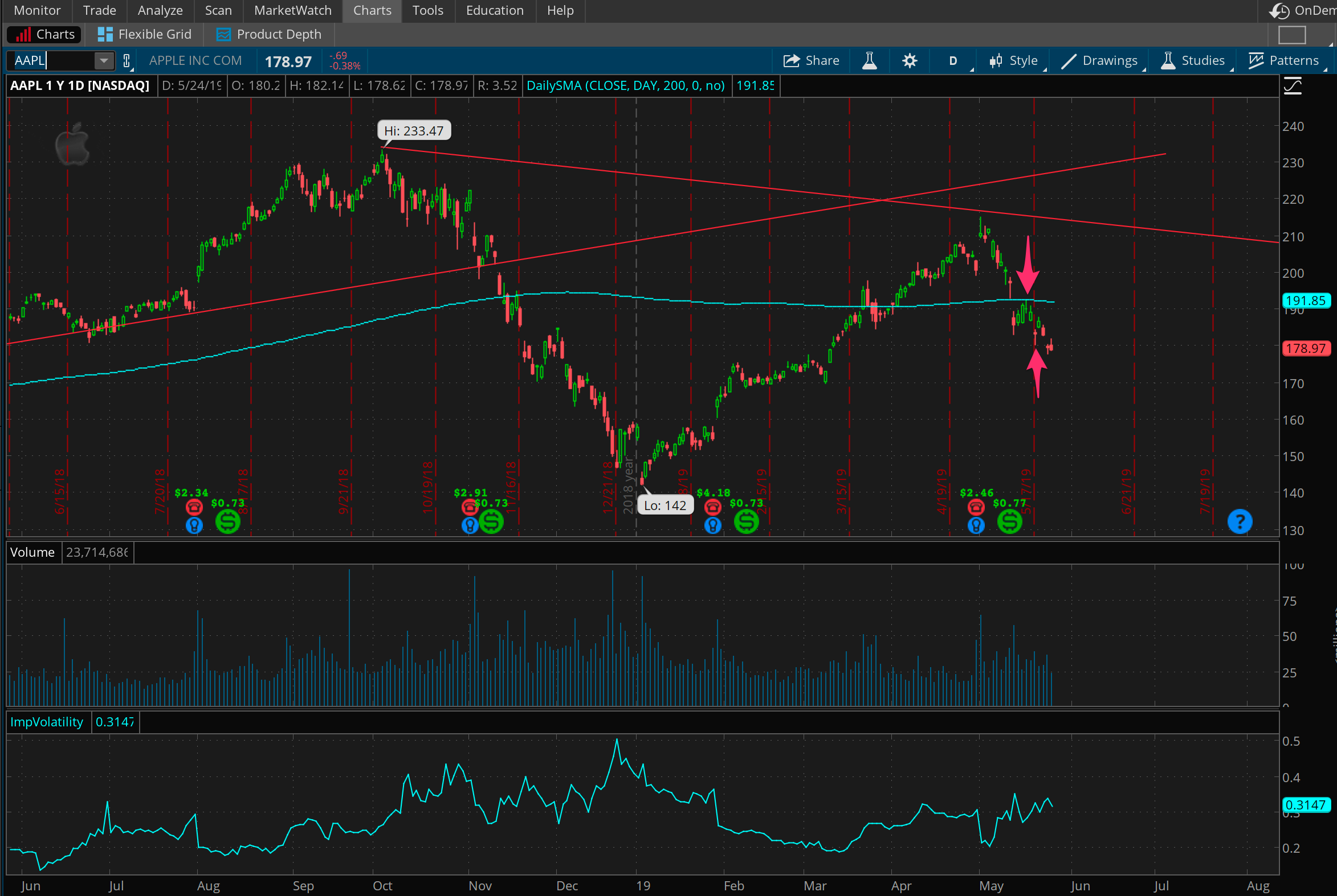
Apple still looks ugly; nothing new there since last week or two weeks ago. The downside trade, a call spread at the 200 level, worked out pretty quickly on Monday (see arrows for entry and exit). Will likely work the same trade if we bounce back up near the 200 day moving average again. Implied volatility is rising so it’s getting to be a decent time to put on something neutral that shorts volatility, but I’m wary of AAPL downside.
NFLX on the range
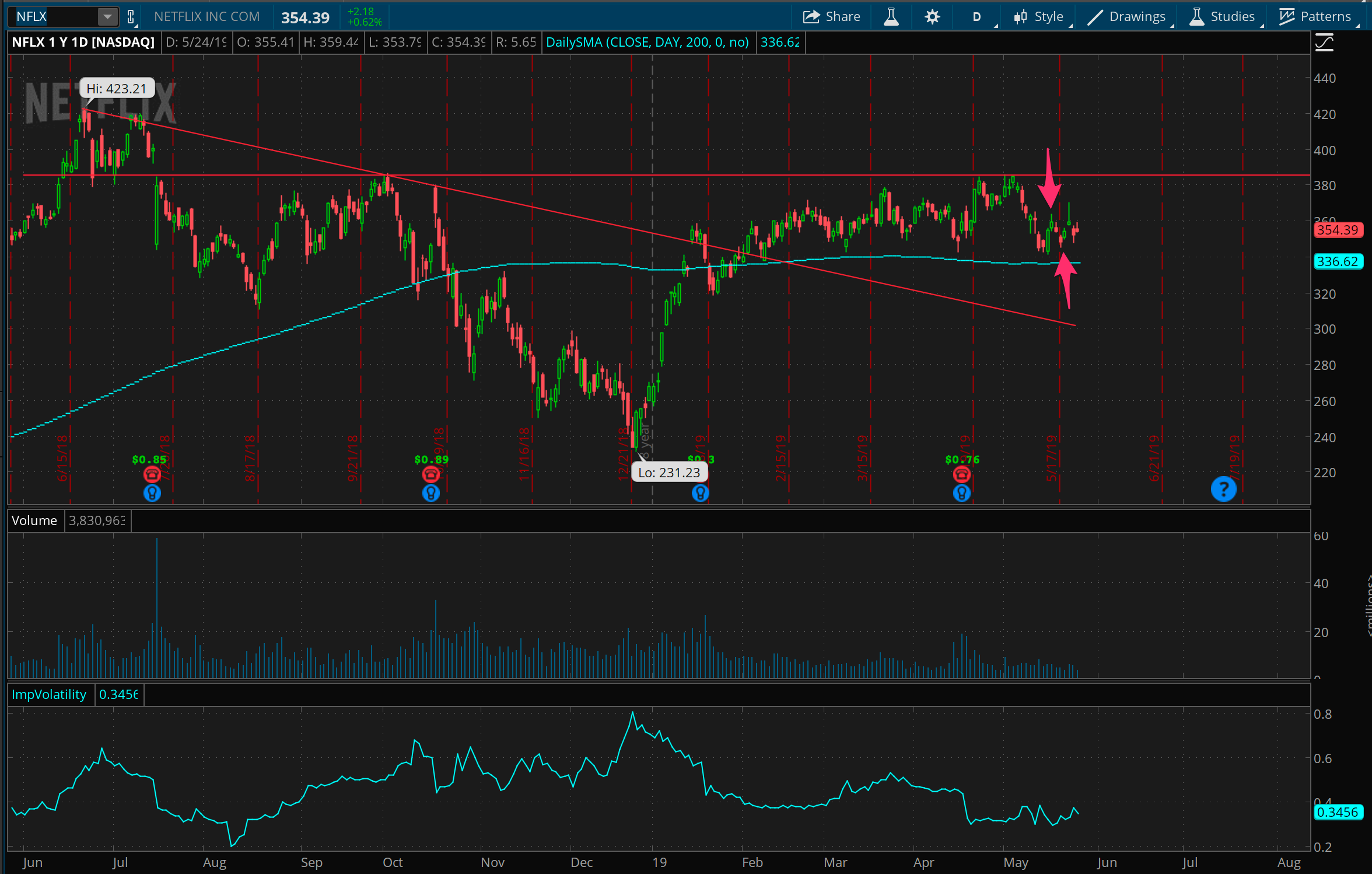
Netflix is staying rangebound as expected, so far. My impatient trade from last week turned into a quick win, trading on resistance all the way up at 385 and never had to worry about getting tested on it, as I got out with a resting order on Monday for a quick profit. Going to keep playing both sides of this range for a while, and frankly I should I have put in the opposite trade on support at 335 (or a little under) when I exited this trade! Will keep stalking this one though.
The Brazilian bounce!
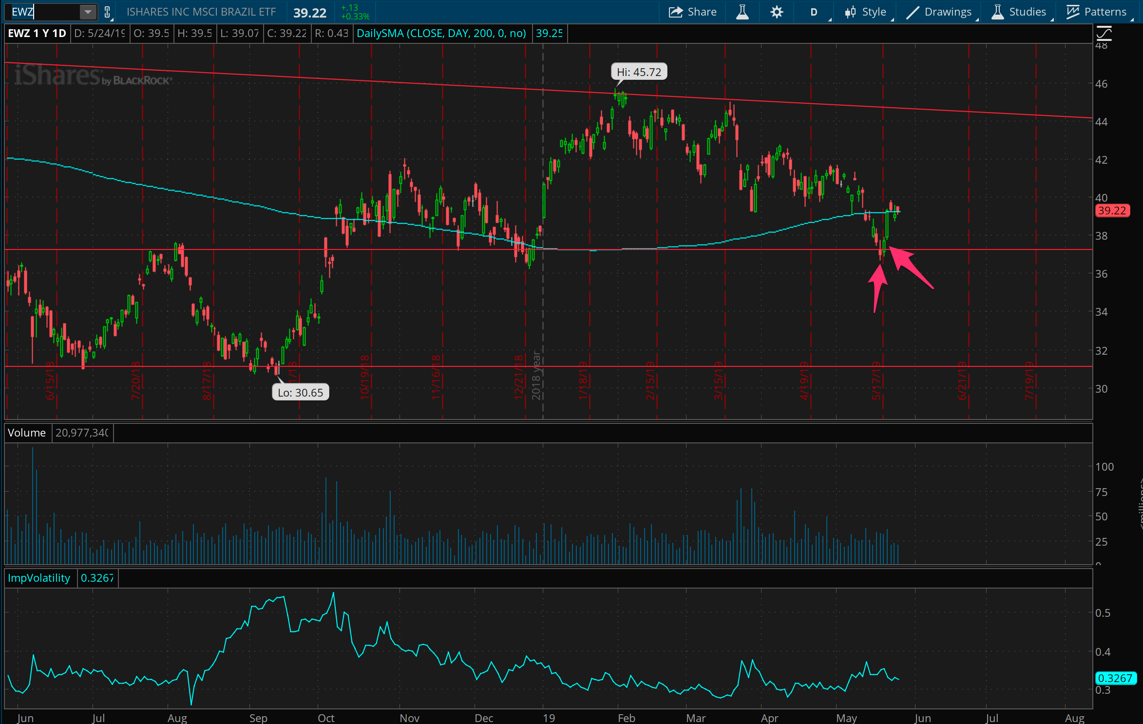
This anticipated bounce in the Brazil ETF, EWZ, worked out beautifully. After putting on a trade for support at 36 last week, this became a quick one day play as things bounced on Monday and I was out for a quick win. Not really too interested in this again until resistance around 44 (and dropping), or support again at 37.
Square support
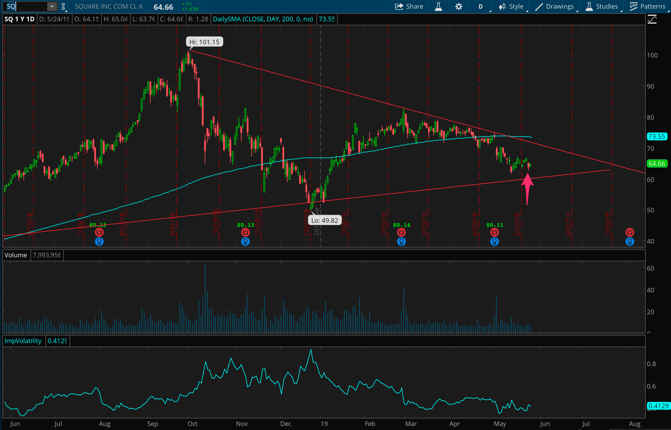
Square one year chart. As covered last week, it feels like there’s some support around 60 here, so I put on a trade for that late this week, looking for a bounce or just sideways movement over the next week or two.
TSLA the falling knife
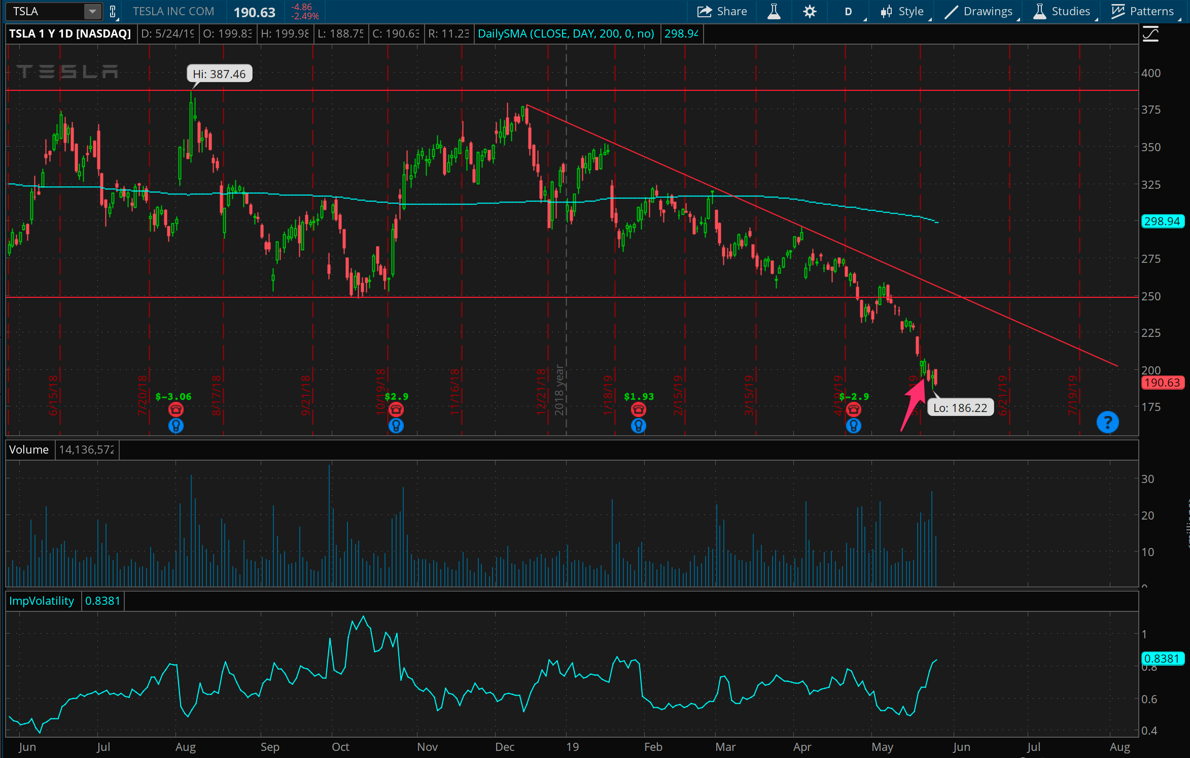
Tesla still looks so, so ugly. But as ugly as it currently looks in terms of the next few months, it looks pretty oversold at the moment. There’s so much negative news and selling happening here right now that it feels worth being a contrarian and fading this move, so I put on a trade betting on support around 175. I have mixed feelings about this trade because it’s a) counter to the bigger trend, and b) trying to catch a falling knife. But, it’s well away from it’s downward trendline, so it feels like a possibility for it to reach back up towards it or else get sideways for a while.
USO gets a quick shock
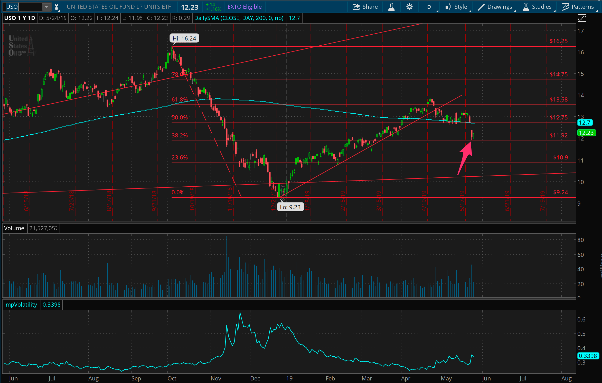
Oil prices fell pretty suddenly away from this midpoint we talked about two weeks ago. As I mentioned there, I am looking to see it bounce between 12 and 14 for a while, so I went ahead and put on a trade for support at 12 late this week. If it moves down further, I’ll neutralize that trade and trade for further support at 11.
Gold resistance?
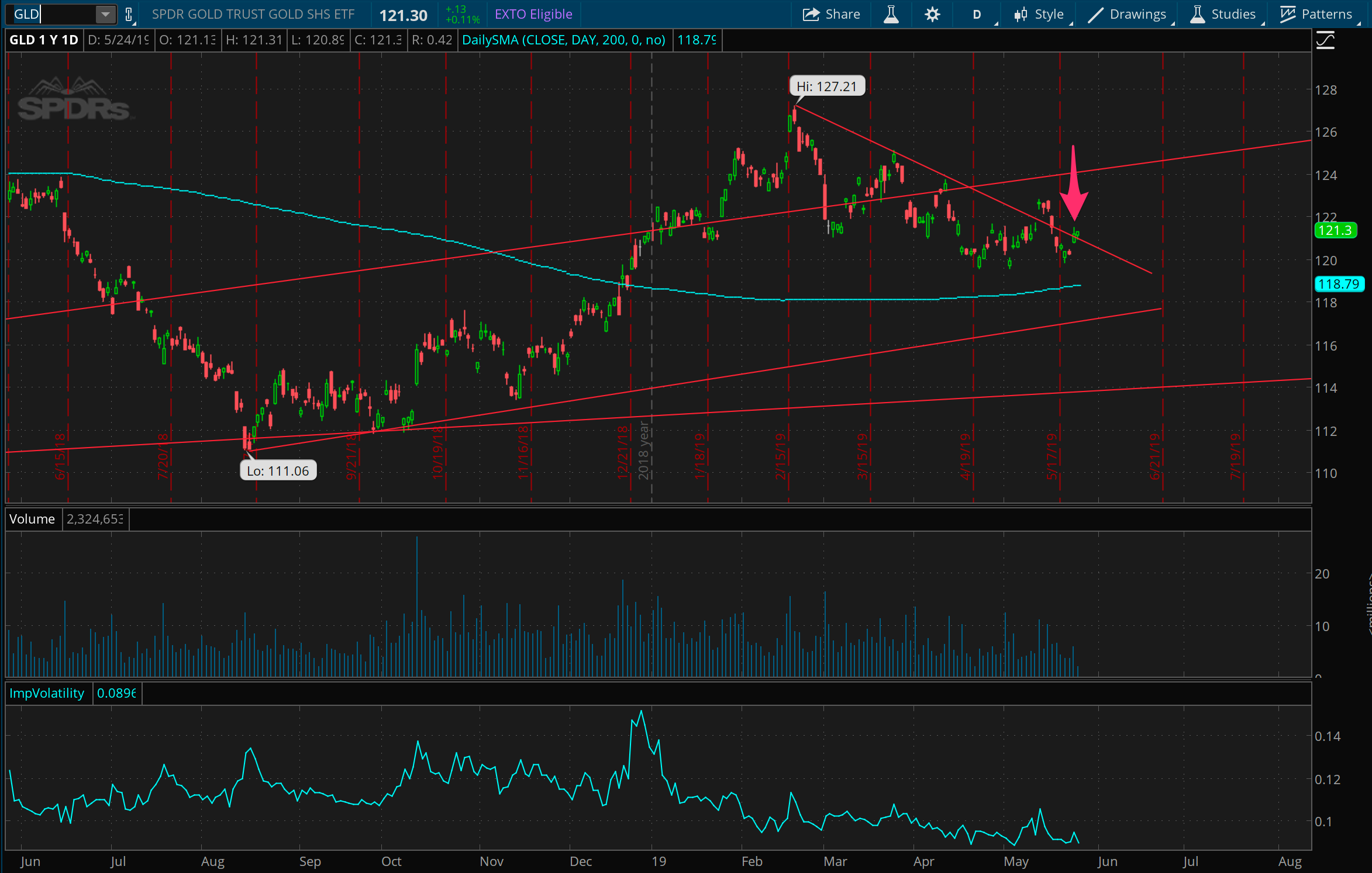
Gold prices hitting possible resistance here. Experimenting with a really cheap trade to the downside through buying a couple junky puts at 118. If it breaks above instead, it’s got some room to go upwards.
Bonds hit multi-year resistance
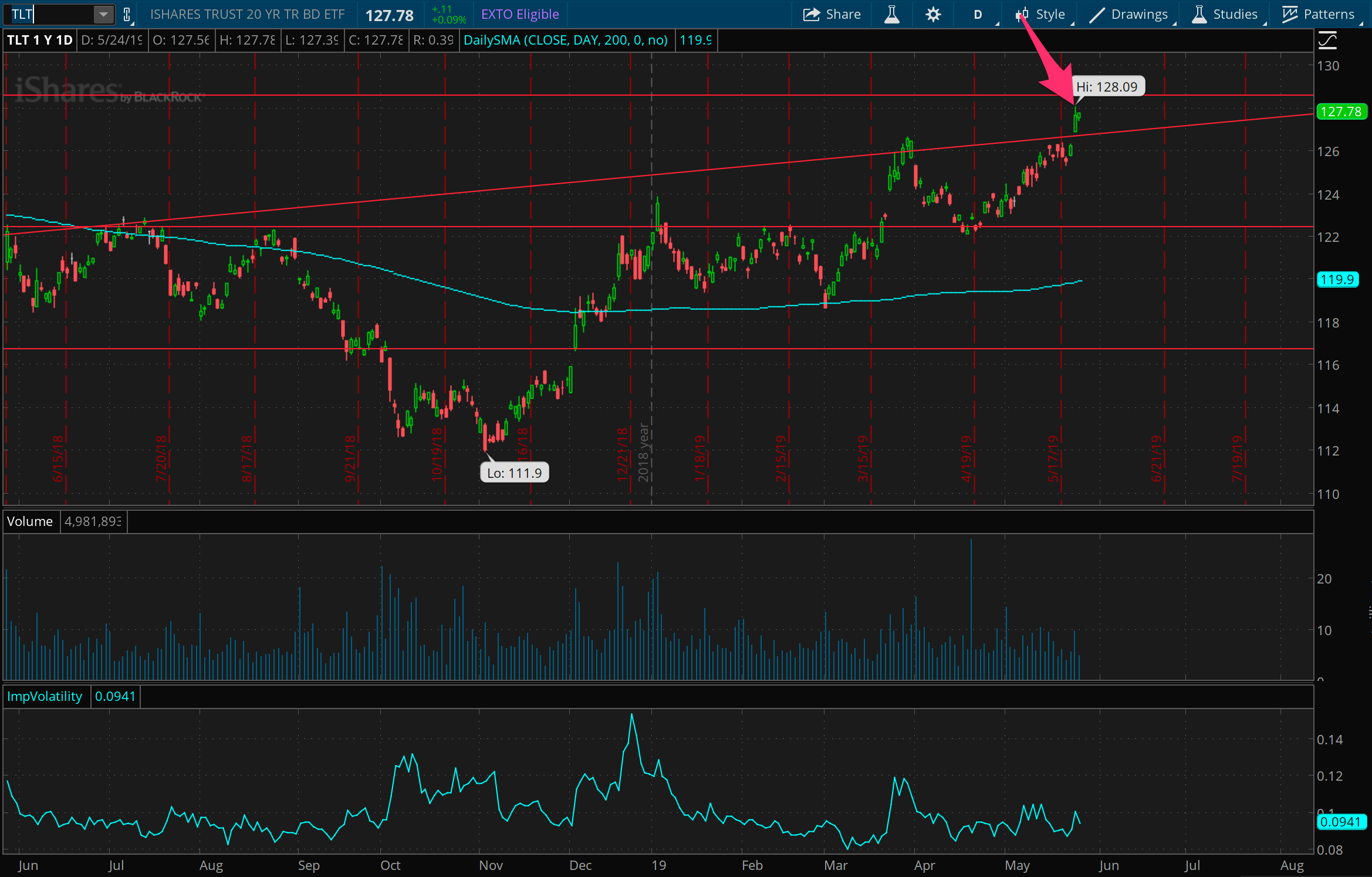
Bond prices also hitting possible resistance. Doing the same experiment with a cheap trade to the downside, since the implied volatility in this is so low.
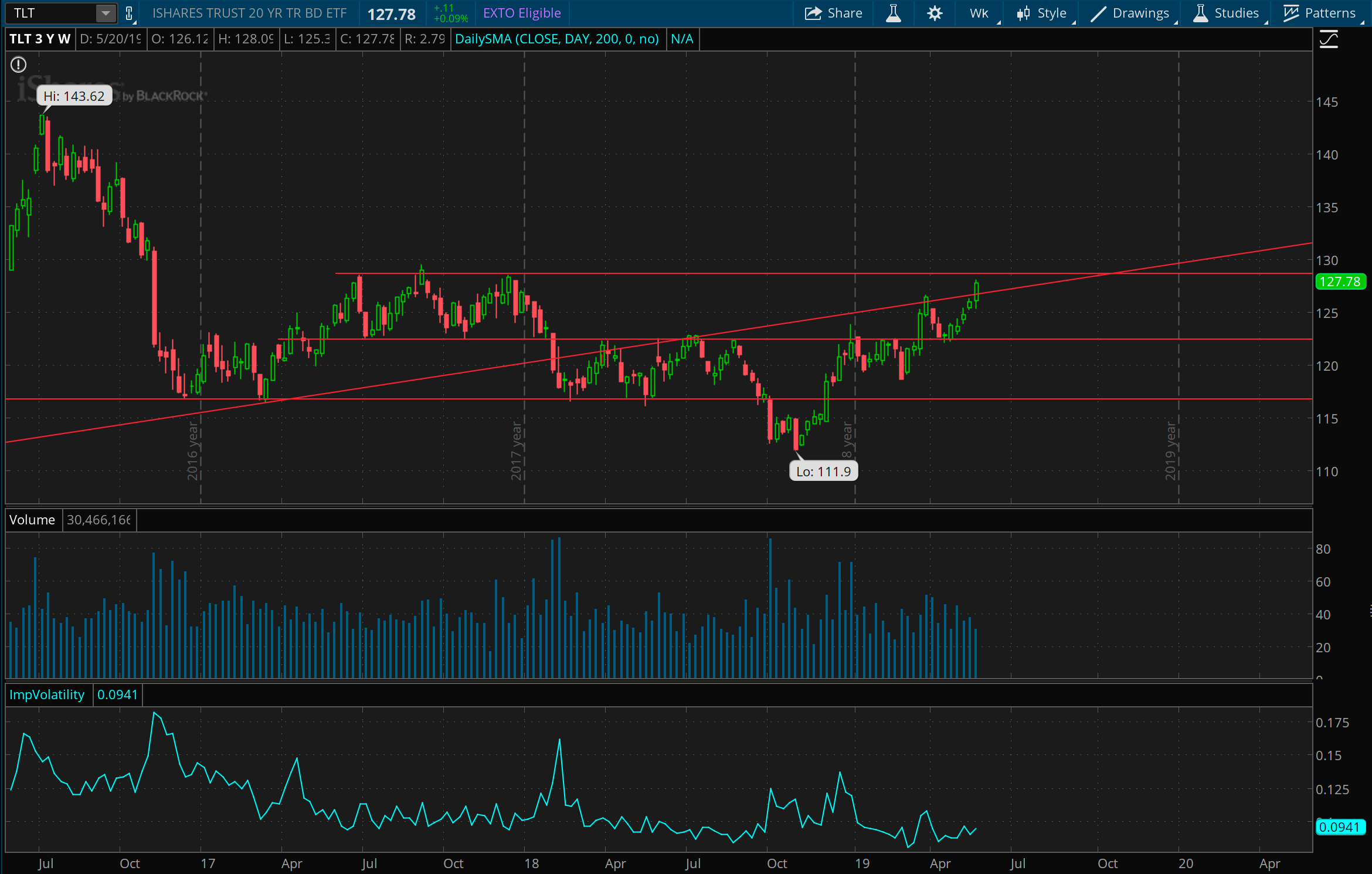
You can see from the 3 year chart that this resistance line goes all the way back to prices in 2017 and the big gap down in 2016 after the surprise in the U.S. elections. This line might matter a lot, and either this will keep proving resistance or else could be a place from where prices head higher, if they break through.
Twitter anyone?
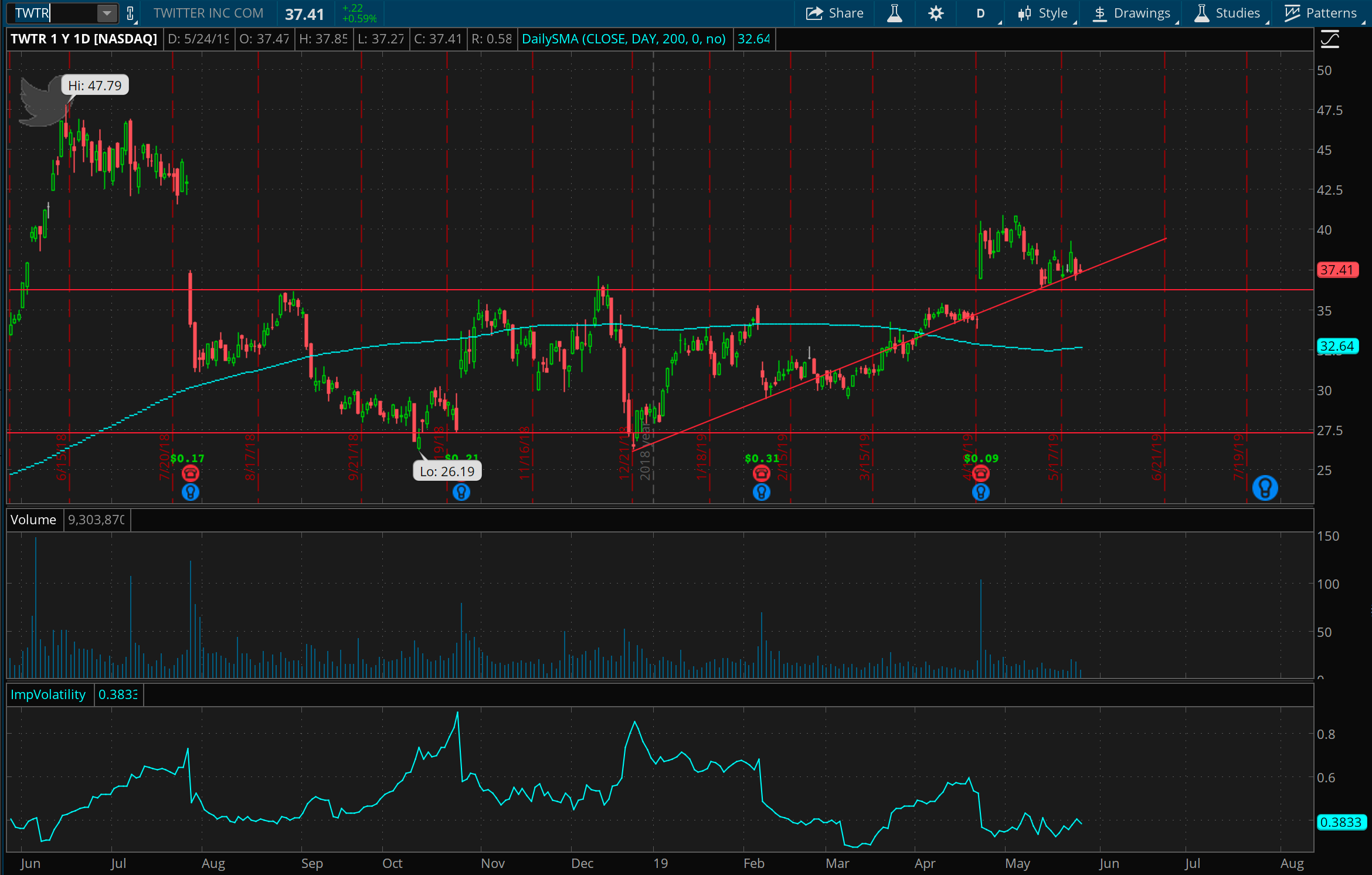
Twitter one year chart. After a good jump above resistance at 35 / 36, this line may now represent support, along with an upward trend for 2018. Thinking TWTR is supported around 36 now and will look to trade on that in the next couple weeks.