Welcome to the big show
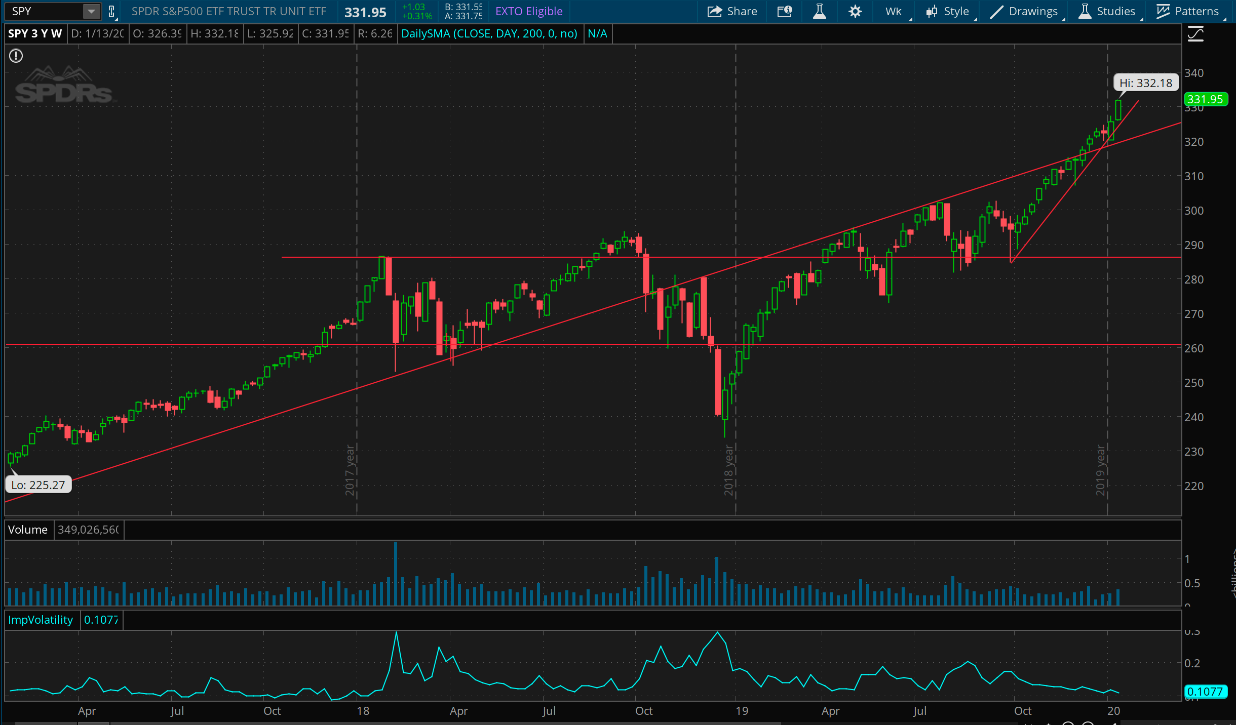
Three year chart of S&Ps (via SPY). Engage face melting mode. From the lows put in at the end of September last year, we’re up over 16%, with ~1.6% gain this week, closing right around all-time highs. No reason to think this doesn’t keep stretching, given the Fed’s shenanigans in the repo market. If and when we crash, the 300 level seems a likely place for the market to stop and think.
Bond wedge
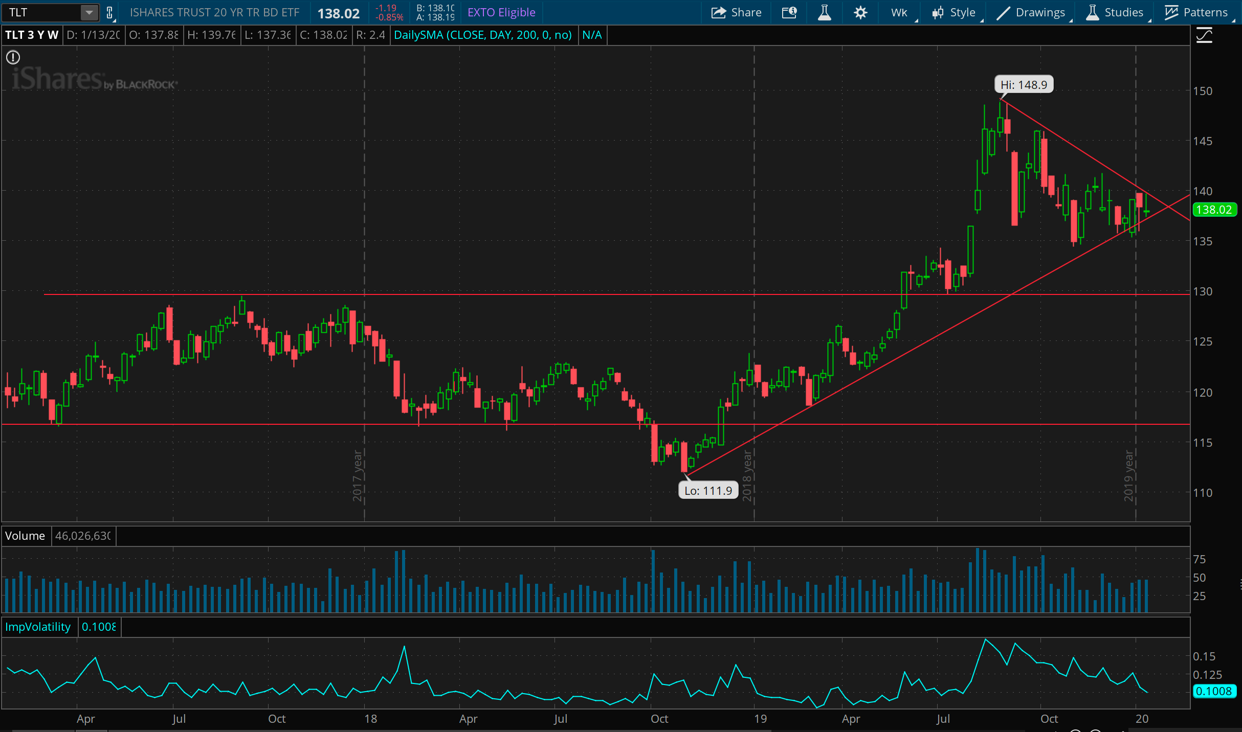
Three year chart of bonds (via TLT). Bonds have definitely retreated in the face of the massive market rally, but these long term trends suggest they’re staying bid. My guess is investors starting to hedge into bonds as they get nervous about the fast overextension in the market. This does feel like a decent place to put on a swing trade to the upside, with a stop somewhere under 135. Given the low volatility, you might buy a strangle to try and play a break in either direction.
Flat with a capital F for gold
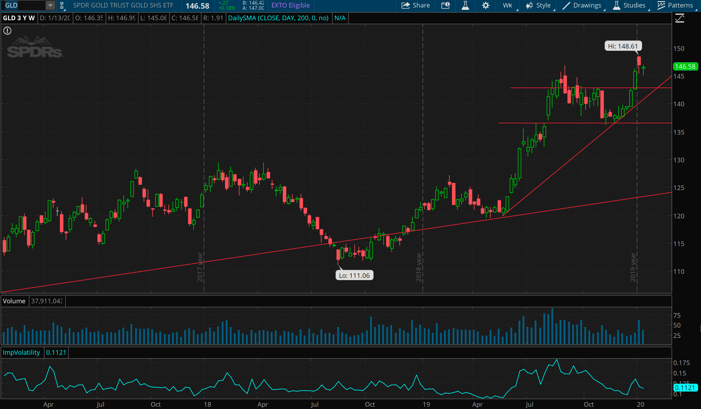
And now three years of gold (via GLD). Gold is hanging around at 7 year highs, registering a pretty flat week. I don’t feel like I have a great read on this at the moment, outside of feeling like some support has been established above the 135 level now. Given it’s rise with the market since October, I tend to think this might be signaling concern about inflation from the Fed’s “not QE” that’s been pushing cash into the system.
Is Oil the honest one?
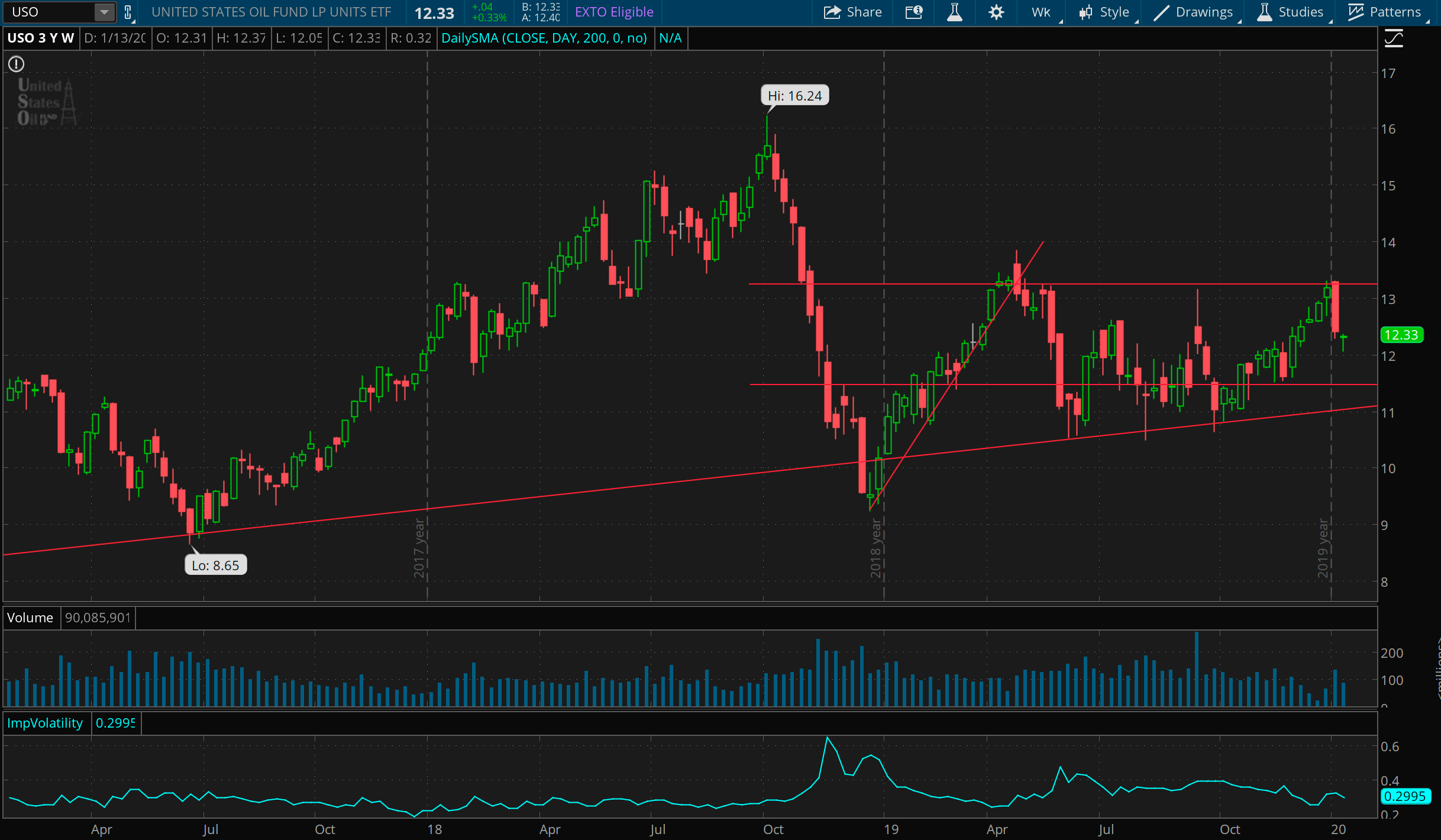
Oil feels like the most honest gauge of global economic sentiment over these past few years. Or at least, it’s been correlated with prior market drops. This drop in Oil vs rise in the market feels like a divergence worth watching. Short term, USO stands a change of holding here. It just bounced beautifully of the 200 day MA (not shown in this chart), and I could see it meandering around this 12 level for a while. Without a doubt, 13.25 is the key resistance for now, and 11 the support.
Lightning round…
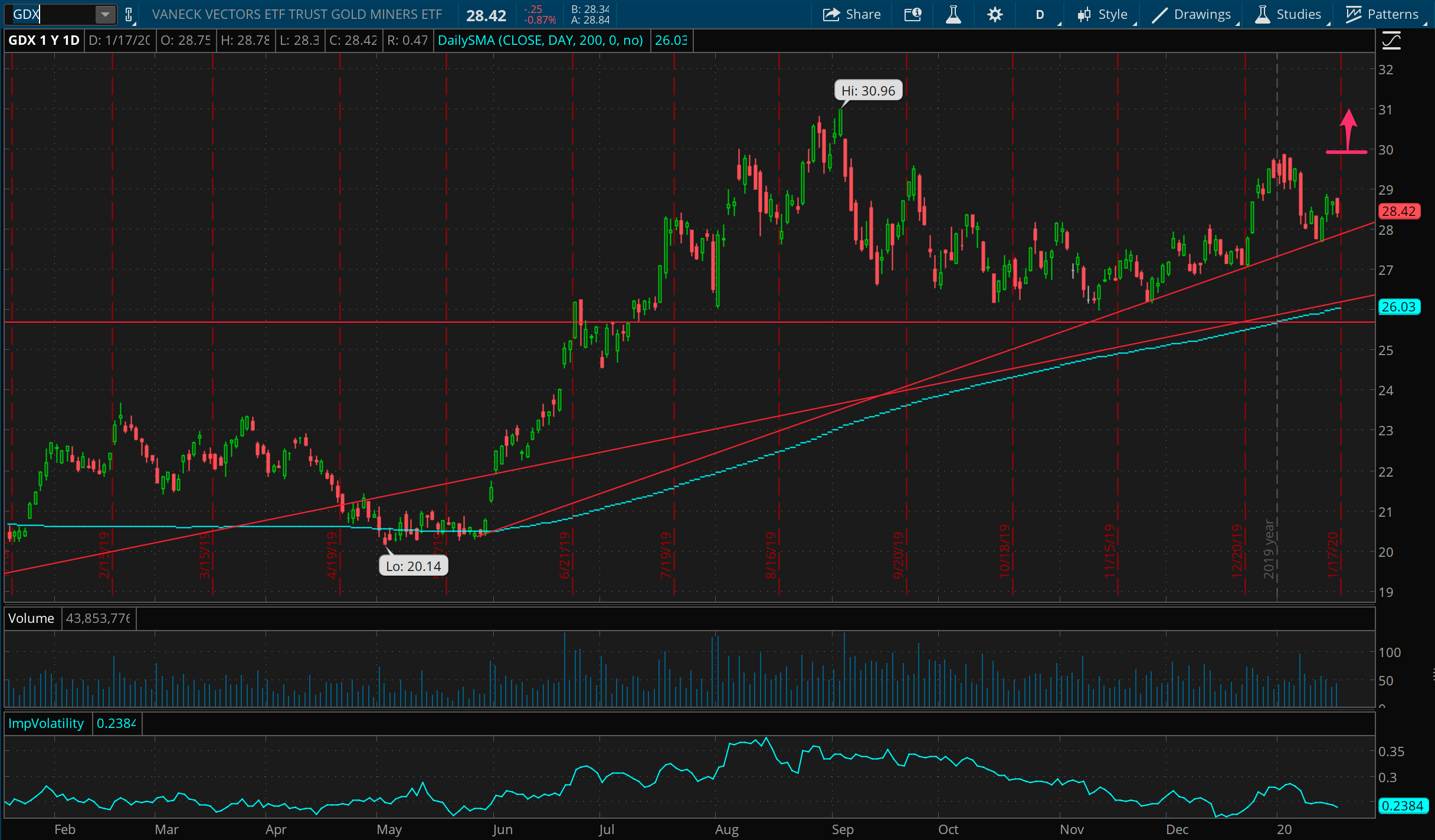
GDX made a nice bounce this week to hold the trend line back from May last year. Currently long Feb 30 calls.
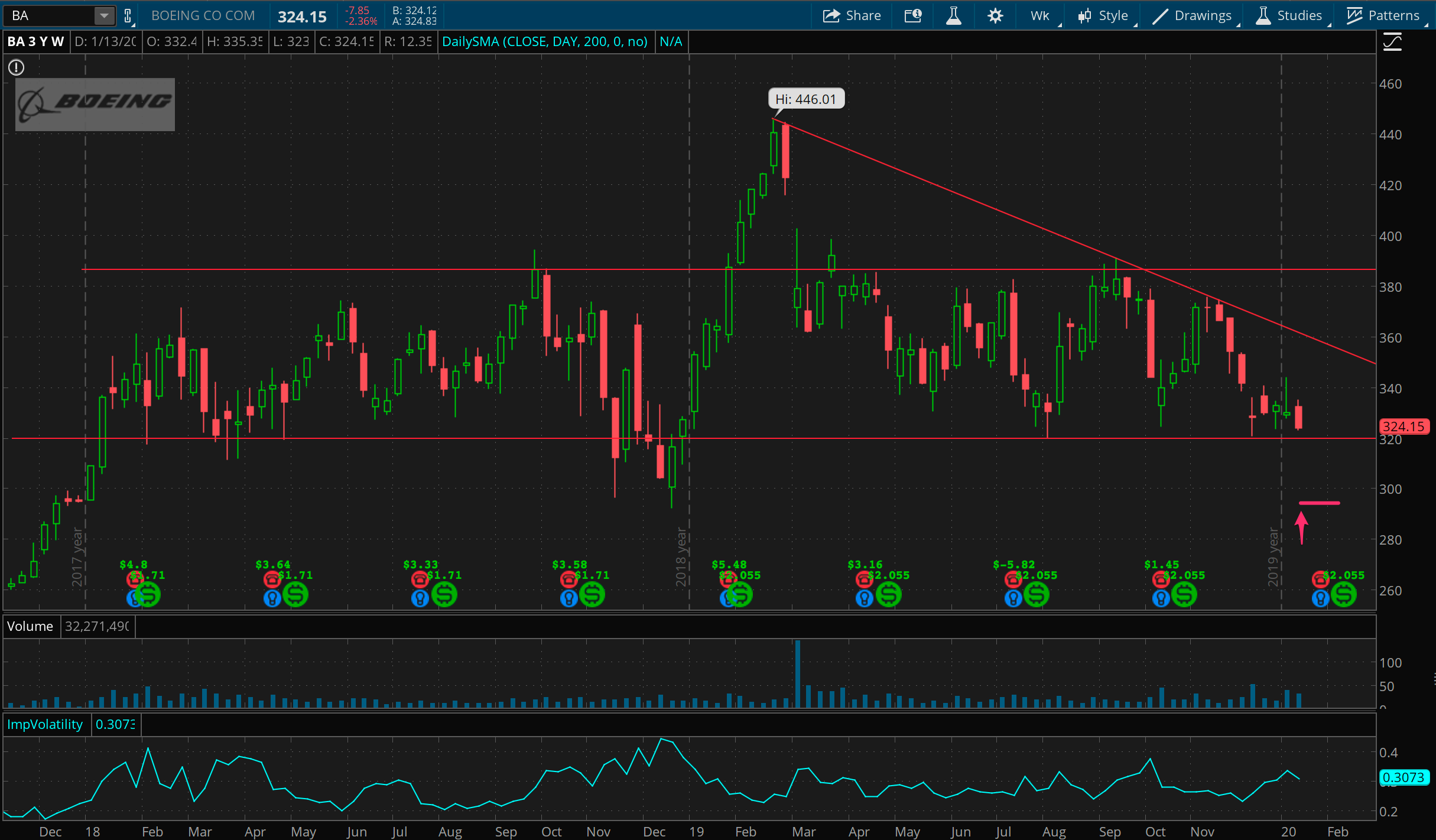
BA sitting on multi-year support around 320. Put in a conservative play selling Feb put spreads around 295, just to get something to play a bounce-or-stay type of price action.
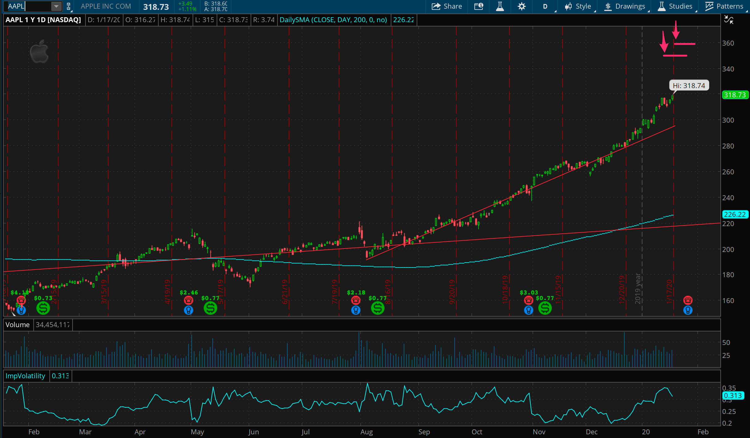
No doubt a lot of people are marveling at Apple’s rise. Last week, I noted that Apple has gained over 80% since the low from August 2019. Given the big rise in implied volatility up here, this appeared to be a fairly safe spot to get some way out of the money calls sold. Have short calls at 350 and 360, and looking for a quick win from a drop in price, or else drop in volatility.
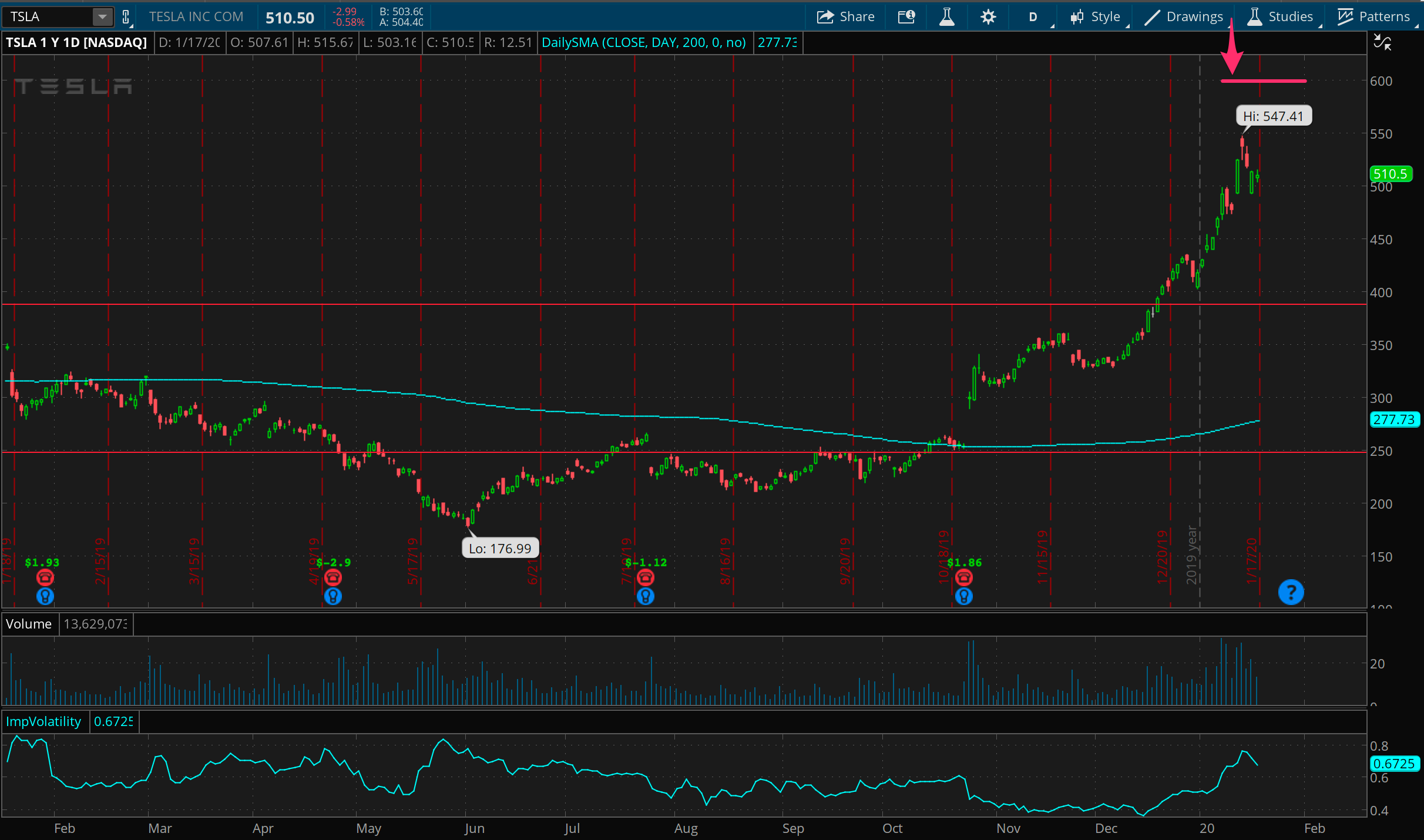
Second verse same as the first. Here’s TSLA. It’s like AAPL, but more insane. Same premise, in terms of spike in volatility paired with extreme up move, leading to a good spot for some way out of the money calls. In this case, call spreads, because… well, it’s TSLA, things can get weird in that stock. This play is definitely still viable and I might look at more of it into next week.
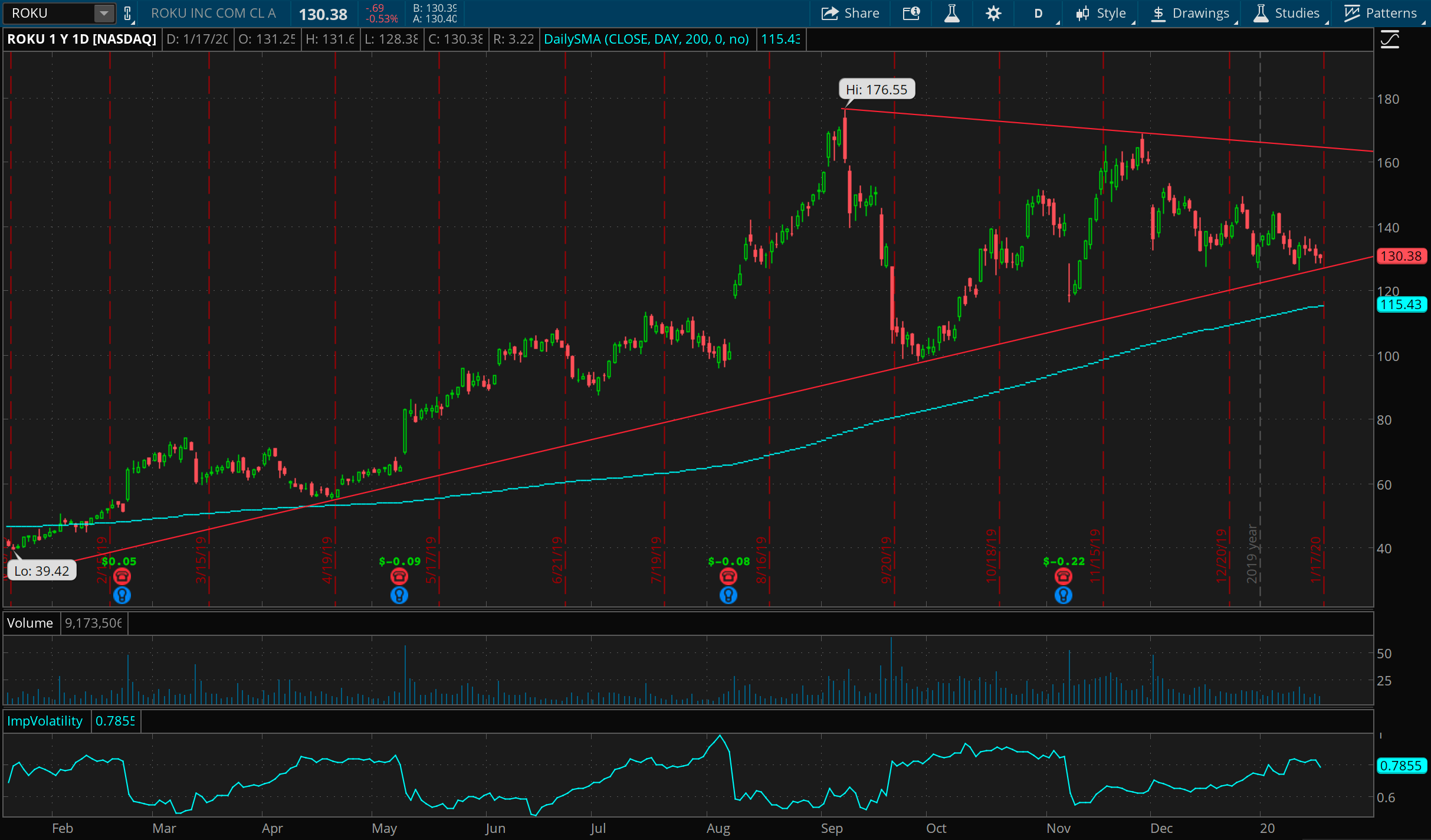
A lot of people are pointing at this same chart of Roku. It’s definitely right at a trend line that’s proven itself a few times. Seems like a reasonable setup with a stop at 115 and target around 160 (or just under).
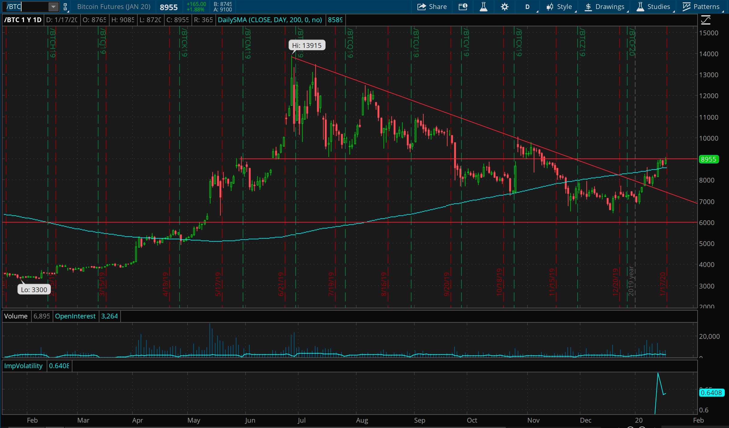
Bitcoin has been silently getting its act together for about 6 months, working out a nice rounded bottom around 6500 and looks very poised to close over 9000. I’m absolutely long Bitcoin on a breakout over 9000, with a stop around the 200 day MA. (This play is certain to kill me, given how much I’m already in love with it.)
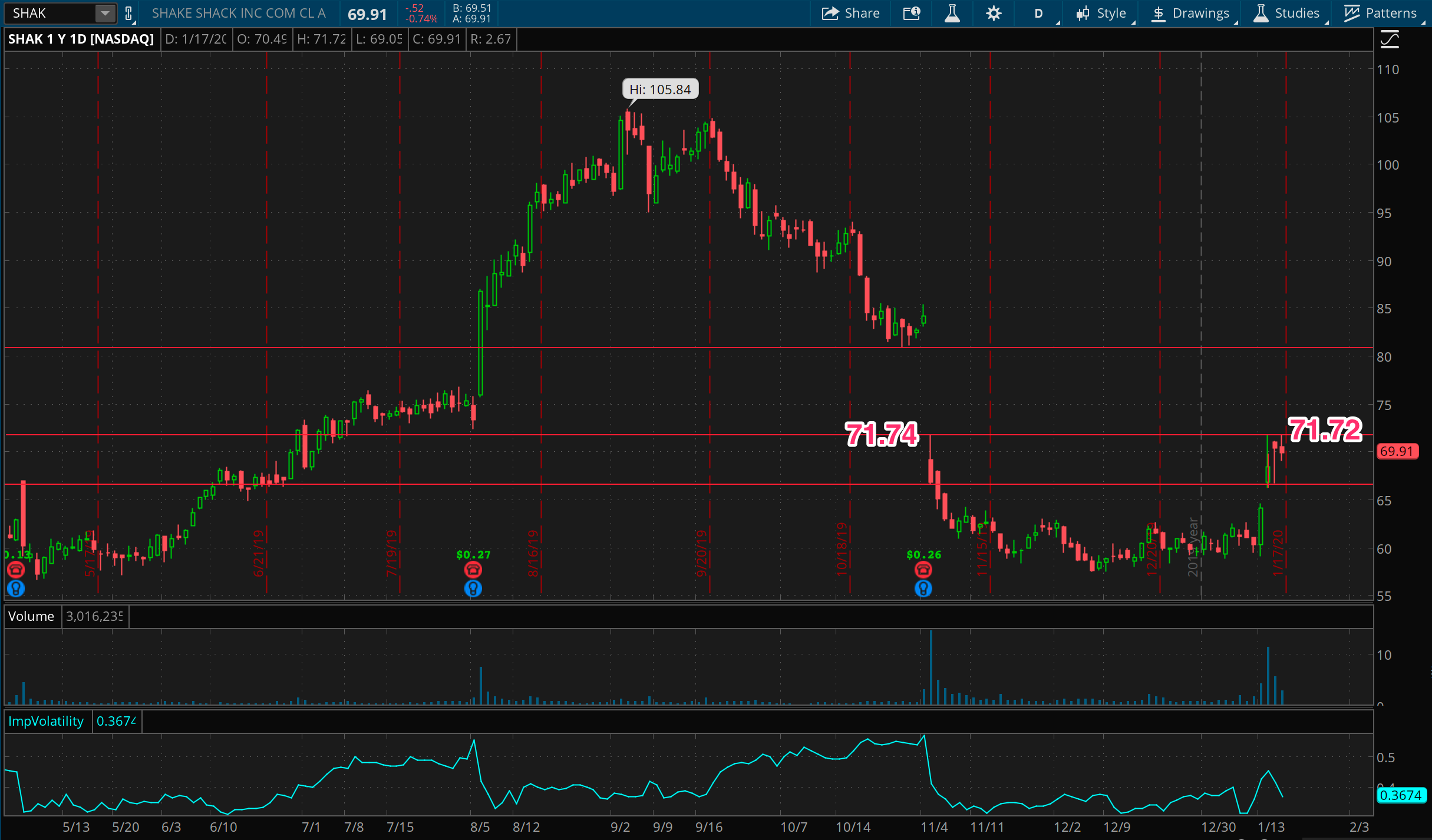
I hold a belief that prices often want to “cover” gaps, meaning that, at some point, prices are likely to retrace the space defined by a major gap up or down. SHAK is looking poised to do just that, if it can close above the 72-73 level. Keep an eye on this one. I’d imagine an entry around 73 with a stop around 71.
The chart of the week
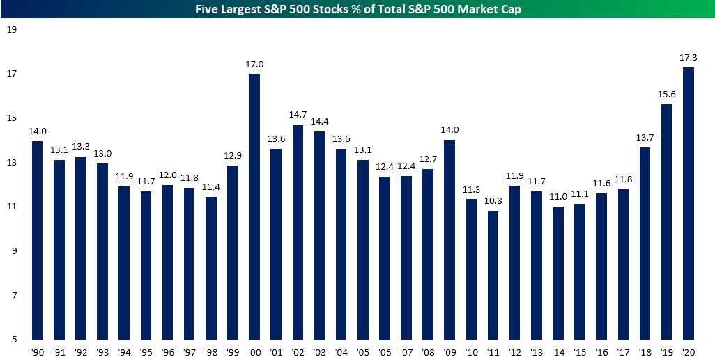
There have been a ton of charts flying around out there about how topped out this market is, from sentiment gauges, to Fed balance sheets, to price indicators, and so on. One argument that I believe is that sustainable market moves have breadth. The more the market becomes defined by a small number of large stocks, the more this could signal an unsustainable trend in buying. With that said, here’s the chart of the week that caught my eye, seen in this tweet from Carl Quintanilla, showing the five largest S&P 500 stocks as a percent of the total S&P 500 market cap.
Not since 2000 my friends. Quite interesting times! Happy trading! Rock this rally but be careful, and if you’re short… hold tight.

