
In our last post in the series, we talked about some underlying theory around diversification. We also learned that the key downfall of this theory is that correlations among stocks change over time, and become highly correlated during broad market sell-offs. (Dynamic correlations really have the worst timing, don’t they?)
But if we look beyond stocks to a broader set of asset classes, we can find the opportunity to create true diversification that won’t abandon us when we need it the most.
In this post, I’ll illustrate the concept with a few charts. We’ll look at stock diversification versus asset class diversification through good times and bad.
About that free lunch…
Going back to Markowitz, the free lunch opportunity we have lies in finding a portfolio of assets which are uncorrelated in their movements, or even better, inversely correlated in their movements (with one asset tending to rise as the other falls).
Now, this next part is key: asset classes are affected by large and often slow moving economic forces. Because of that, the correlations between asset classes are more likely to be persistent over long periods of time, through different economic conditions. The result is a more stable set of correlations, leading to a portfolio that provides strong and consistent risk-adjusted returns.
Rising apart and falling together
First let’s look at how different stocks behave in rising and falling markets.
We’ll start by looking at a “steady” economic environment, like that of 2007.
This graph shows six stocks out of the S&P 500 representing stalwarts of different industries: technology (MSFT), airlines (BA), construction (CAT), health care (PFE), energy (XOM), and financials (BAC).
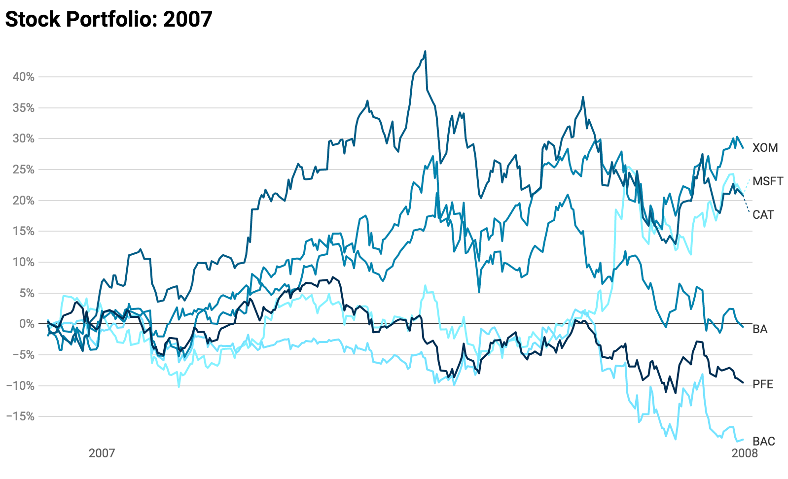
Under “normal” circumstances, stocks of different industries are not all that correlated. Some go up while others go down, and they can often move in opposite directions. In the above, notice that Pfizer started rising as Caterpillar and Boeing started to fall. Microsoft kicked into high gear as financials started to suffer. The result of these differences is a portfolio that has less overall volatility.
Now let’s look at what these same stocks did during 2008, a year of around 40% losses in the broad market. (Read: Not so steady.)
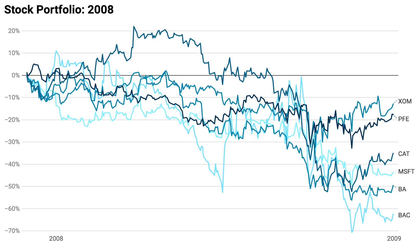
While the individual names in this basket of stocks had a wide range of performance, they unanimously fell. Not a single instrument was able to hold up this portfolio, and during the panic selling in the fall of 2008, they all fell by 20% or more in a very short period of time.
In those times of panicked market crashes, all stocks tend to participate. The correlation of all stocks approaches 1, or fully correlated. And in the wrong direction! The risk protection we seek in diversification then disappears during such times, and our overall portfolio can exhibit dramatic volatility.
In the meantime…
Now let’s see what some other asset classes were doing in the meantime. Our instruments in this case are all ETFs that track the price of an entire asset class:
- SPY - domestic large cap stocks (i.e. the S&P 500)
- TLT - long term US treasury bonds
- GLD - gold
- LQD - investment grade corporate debt
- TIP - inflation protected short term treasuries
This is definitely not exhaustive of what’s out there in terms of classes, but it’ll do well for our purpose of illustration.
Now to revisit our two economics periods with this cast of characters.
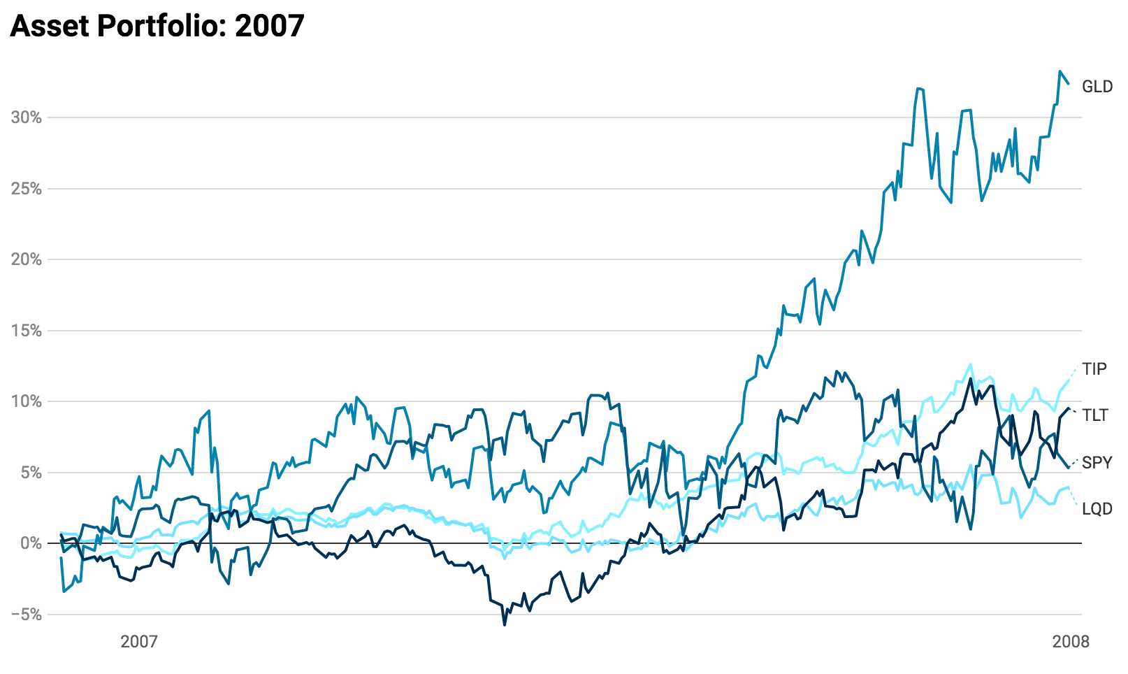
In some ways, this looks similar to our stock portfolio during 2007: different instruments moving along their own paths in a fairly uncorrelated way. There are some key differences though.
For one, there’s less overall variance in the returns. When we looked at stocks, we could see more individual variance due to the unique influences on each company. Here though we’re observing the valuation of an entire class of assets through the prices of each ETF.
That’s not to say there are no outliers in an asset class portfolio. Clearly gold was a significant outperformer during 2007, no doubt due to the fact that inflation appeared to be picking up during the year. In other years, such as the one we just experienced in 2019, equities can become the major outperformer. Sometimes it’s treasuries, when interest rates are falling or even just expected to fall.
These factors go beyond those faced by individual stocks, like a change in executives at Boeing for instance, and instead represent major trends or changes in broad investor sentiment.
Now let’s move on to 2008, during the global financial crisis.
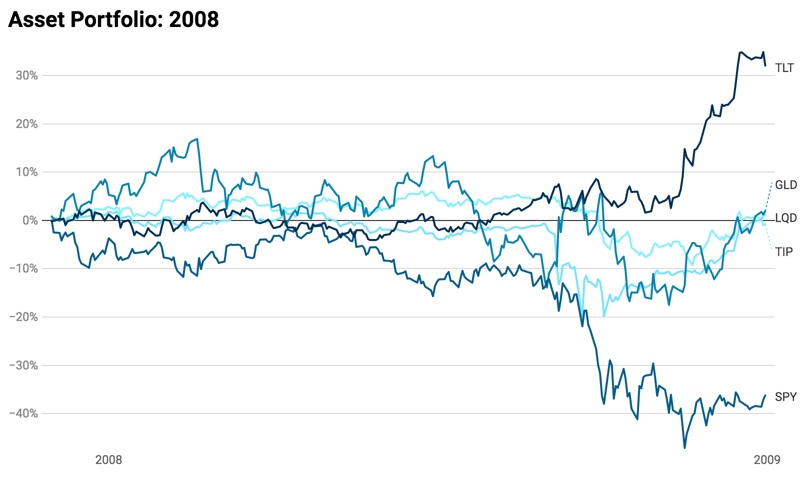
Well that’s a bit of a different story. Investors didn’t just sell out of the US market and stuff the proceeds under the mattress, they moved that money into other assets. In particular, demand for U.S. treasuries, shown above via TLT, exploded in Q4, and led to a nearly 30% rise in bond prices with just a couple months. While equities were crashing down, bonds were crashing up.
But why?
Partly this effect is because huge amounts of money can’t just sit as riskless cash in some savings account at a bank. Hedge funds and trading shops would quickly and far exceed the $250,000 insured by the federal government (though this insurance does a good job of preventing consumer bank runs).
The money has to go somewhere, and the very next best thing to government insured cash is government debt. Though it’s not quite as liquid as cash, it’s actually a safer place, in relative terms, to park a lot of money.
When stocks fall and economic conditions worsen, the expectation is that central banks will step in to help stimulate the economy by lowering interest rates. And when interest rates fall, the prices of bonds rise.
Because of this rush into a safe place to park money, combined with an expectation of lower rates, we see this counter effect in bonds during fast falls in the market. As stocks come crashing down, bond prices tend to crash up.
A similar effect can happen with gold, as investors look to park cash in a “safe haven” asset, and in anticipation of potential inflation from future monetary policy, though this is just one of many reasons gold prices may rise.
Each asset class has its own influences and interactions with the others. Some assets are affected very similarly by the same economic forces, such as domestic and foreign stocks. In that case, we see a correlation in the returns of those assets. Others act oppositely as outlined above, and in those cases we see a negative correlation between them.
Now, to build
In the next post in this All Weather Portfolio series, we’ll talk further about the key elements of change when it comes to economic conditions and outlooks, and lean on the work and wisdom of Ray Dalio to help explain them. Then we’ll use the asset classes discussed in this post to build a very simple and easy-to-maintain portfolio that can hold up well in any weather.